Thursday, January 19, 2023

How to Start Over with Weebly Page Builder. Undo Everything and Start Again.

What if you want to delete the website you've been working on in Weebly and start over fresh with a new design?

How do you delete the Weebly website you've been working on if you've got it all messed up and you just want a fresh start?

You can delete your Weebly website by making a new website and then deleting your first website.

In your dashboard, click on My Site

Weebly Dashboard location of My Site link

Then click on Add Site

Weebly click on add site to add a second website

Choose a new theme for starting over or use the same theme.

Weebly will take you to the editor and you'll want to X out of that (Click the X in the upper left)

Then you'll be back at the dashboard and you'll have a link in the upper left corner called My Sites

Weebly click on the other My Site in the upper left to see your different websites


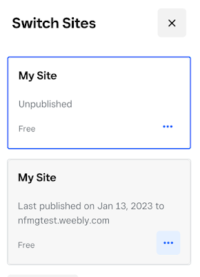
Click on that, then in the sidebar that opens,

Weebly then a side panel open up, showing your websites


Click on the three dots for the website that you want delete from Weebly and choose delete.

Weebly click the three dots for the site that you want to delete


This will delete your Weebly mess and allow you to choose a new theme and start over again. Now you can experiment with Weebly options, layouts, content items and not worry about goofing it all up and being forced to undo all your mistakes.


Wednesday, April 28, 2021

Fix tiny text in applications on high resolution monitors


Window scaling issues on high resolution (4k) screens can cause problems like tiny text in the application or menu items that don't appear or panels that have scrambled text.

This blogger gives a method for telling Windows that an application is actually not DPI scaling aware. 

http://www.danantonielli.com/adobe-app-scaling-on-high-dpi-displays-fix/ 

You can use this to fix tiny text in Photoshop CS5, Quickbooks or games like Lord of the Rings Online (LOTRO).

You can also right click on the icon and go to Compatibility settings and check the box for "Disable Display Scaling on high DPS settings" 

If this box is greyed out, click on the change settings for all users button, and see if it's checked there.

Hopefully using one of these methods will fix the text and menus in your application so you can happily use your fancy 4k monitor.


Saturday, October 12, 2019

Switching from Windows Live Mail to Thunderbird Using These Tricks for Exporting and Importing

Importing email from Windows Live Mail to Thunderbird


Why might you want to switch from Windows Live Mail to Thunderbird?

Because the Windows 10 Mail app doesn't support POP3 email. Yep, that's right. How stupid is that? IMAP only.

And, Windows Live Mail isn't available for Windows 10.

So there you have it. If you have 15 years of email in your POP3 inbox, you cannot use the Windows Mail App. You have to install something else, and if you are on Windows, there are very few decent free email clients to choose from.

It is possible to export emails from Windows Live Mail. Choose Export, use the Windows Live Mail format (or you'll get a MAPI failure error message) and then, important, pick a folder to export. You have to pick a folder, and not the account you're exporting from, other wise you get zero .eml files.

If you see a count of emails being exported, then it worked. You should end up with a folder full of .eml files.

Then, on the new computer, in order to import email into Thunderbird, you just drag and drop the .eml files into a mail folder in Thunderbird. You don't have to use an Import method, and you don't have to use an extension or add-on.

Thursday, October 13, 2016

Advice from Dad - Buy Quality Tools

My Dad always said to buy the best tools you can afford and then take good care of them.

This has worked out pretty well for me. I have purchased a couple of expensive, quality computers and they have far outlasted their computing generation.

My shovels last more than one gardening season.

I have and use a pair of decent headphones that I purchased in the early nineties.

If you buy good hiking boots they last more than one season.

Good knives stay sharp longer and make your kitchen work easier, forever.

You have to have good kitchenware to produce good results. I've been able to piece together a good collection of pots n pans from garage sales. I love my 40 year old cast iron skillet. I will be able to pass it down to my grandchildren.

When I was in college, I did some house painting. Using higher quality brushes allowed me to work faster and produce better results.

Monday, June 27, 2016

How did you become a web developer? Which language did you start from?

Someone asked me "How did you become a web developer? Which language did you start from?" and here is my story about that.

I am a consultant. I work for small business owners, advising them on internet strategy and then executing on those strategies. 

I started out in 1998 with 2 years of computer science background from 1982 - 1984. So, no web technologies in my toolbelt. We were doing our programming on teletype machines, our applications were printed out on line printer paper. We didn’t even have green screen terminals in the computer labs in those days.

I was MOTIVATED. Once I decided I wanted to be a web designer, I read everything I could find on the topic. I bought books. I started making really ugly web pages. Eventually I got a volunteer project and learned a lot by overcoming obstacles in order to achieve my vision for that simple little website.

I got a job at a web design agency doing some low level HTML editing. When they folded I got a job at another web design agency as a “Project Manager”. My boss there was an idiot, so I got a job working for an ecommerce company as webmaster and network guy right before the dot com bubble burst. 9/11 happened. Recession. Then I got another agency job, and that agency folded as well. From then on, I was on my own.

An acquaintance who was a business consultant wanted me to make a small site to attract leads and so I had my first paying client. And I made him a nice little site formatted to fit a 640 x 480 screen, which was a big improvement over his old FrontPage site. And it worked well. I got him top of page one rankings right away. Leads came pouring in for him. He was getting a 10% submission rate on new leads in his very specialized field. I wish I had set up our deal so I got a referral bonus for the business I brought him. I would have been able to quit working.

Then I started to get referrals for more little sites. Each one posed new challenges that I had to overcome to bring them to light. I had to learn how to set up an ecommerce system. I had to learn CSS positioning for layout.

One thing I should note is that when I started out things were not so complex. We were still on HTML 4, not even xhtml yet. We used tables for layout. There were no javascript libraries. We were barely even using CSS. Most pages were made by hand, not using a CMS. ColdFusion and Perl were the hot scripting languages.

New guys coming into the field have a lot farther to go these days in order to be considered “professional.” For me, there was no stack. It was all just HTML and CSS.

But the path I followed should still work. Devour information like mad. Do some volunteer projects, so you get some practical experience. Show your work to people who need that kind of help.

It took me several months to get the first job doing low level HTML editing. And then in this job I wasn’t even making pages. Just editing documents.

It seems like there is a fair amount of demand for web workers these days. I think your prospects are good. Try to find normal, healthy people to work for. I had some bosses who were not right in the head, but they hid it well enough so that I accepted the job offers. If their employees are making excuses for them… beware.

Good luck!

A couple other things:

I started using the Internet in 1992. The University I attended had a 56k leased line because one of the professors was working with NASA scientists and they needed to share data. 56k… for the whole University. There was no web. Text only. FTP, WAIS and Gopher sites. We logged-in to a Unix server. I learned Unix before DOS or Windows. We sent email with Pine. We edited text with Emacs. I couldn’t do it now, but I was an Emacs wizard back then. I was totally into it.

WIRED magazine had not yet published it’s first issue. Dialup speeds were 2400 baud. There was no DSL. Windows PCs were running on 286 processors.

I wish I had bought a bunch of domain names back in 1993. Just about anything you could thing of was available. Hardly any companies had even thought to register their own names. I know, because I checked. But domains were really expensive back then and I was making low wages. They were $100 (later $70) and my rent at the time was $145 and I was making $4 or $5 an hour. But still... just a couple good 4 letter domains and I would have been able to stop working by 1999.

When the first issue of WIRED came out. I subscribed instantly. It was an amazing, cutting edge magazine back then, both in terms of design and content. The design of WIRED influenced greatly the look of the early web, and even what hip print design was supposed to look like in those days. "CYBER" became a word. "MEME" became a word.

Then in ’93 I moved to a small town where no one had ever even heard of the Internet. No one. The only access was Compuserve, which was a long distance call on the modem. The first internet service provider didn’t show up in this small town until 1995. But when it did I spent a great deal of time hogging the phone line with my 486DX-50, Windows 3.1 and Netscape Navigator. I remember akebono.stanford.edu before it became Yahoo. I remember what searching was like before Google.

I also started fixing computers for people since I am a techie nerd and stuff like that comes easily. I still fix computers as part of my consulting. It’s easy money.

I got a trial copy of Dreamweaver 2 in 1998 and started experimenting with HTML and CSS. Making links and placing images in simple page. Then when I got my first volunteer project I bought a copy of the text editor Homesite, and a book about HTML 4. When I got hired as the webmaster for the ecommerce company, as mentioned above, I bought Dreamweaver 2, Fireworks 2 and a nice flatbed scanner.

I’ve been using DW ever since. It makes a fine code editor. And FW is still the best web graphics tool. Homesite has been replaced by Notepad ++ in my toolset.

I’ve added this extra information because it fleshes out the story of my journey to becoming a web consultant. I realized that I have always had a strong interest in doing this type of work activity and that my background has played a large factor in getting me to where I am now.
Tuesday, May 17, 2016

Cut your mini SIM down to nano size

If you need to cut your micro SIM down to nano size in order to fit in your new phone, here is a page with a working template in both letter size and A4 size.

http://trendblog.net/diy-cutting-a-micro-sim-into-a-nano-sim-card-for-your-new-phone/

The page that Google is featuring in search results has a template that is for A4 sized paper, which us folks in the US probably don't have.

Thursday, February 18, 2016

Observations on Font Pairings for 2016

Here are a couple pages with a bunch of interesting typeface pairings.

But first, a couple comments.

Body copy on the web used to be presented predominantly in sans serif fonts because on 72dpi 1024 x 768 screens it was a lot easier to read. Nowadays with the advent of retina screens and 1900px monitors it's not such a problem to read serif type on screen. Here... this is Georgia and it looks pretty nice, eh? It's one of my all time favorites. Like the blues, I just never get tired of it.

These days, top designers are using serif fonts for body copy. Look at http://www.wired.com/2016/02/zika-conspiracy-theories/

and at https://stuffandnonsense.co.uk/process

Personally, I am not a fan. I like sans serif type for body copy. I also don't like the current flat design trends. But, I think in order to look modern and professional it's important to follow these trends.

So, here are a couple pages with a bunch of nice Google font combinations.

This first one is really nice. Each pairing gets it's own mini-design. Look for the one about the fox and the grapes, and notice your cursor. Click on the grapes?

http://femmebot.github.io/google-type/

The next one only has a few, and much more simply and directly presented.

http://briangardner.com/google-font-combinations/


I looked at a bunch of magazines in my reading pile and they seemed to be split between serif and sans for body copy. Some even had a mix of types in different articles.

Another thing to consider is that it's not just about headlines and body copy. There are also captions (where sans still makes a lot of sense) sidebars, callouts and other elements which might not strictly follow the rule of Header & Body. The choices you make for these other elements can add a lot of polish to your design.


There, those are my thoughts on types of type.